|

 Python 프로그래밍 > XlsxWriter 설치 및 엑셀 출력 예제
Python에서 출력 결과를 엑셀로 만드는 방법은 여러가지가 있습니다.
구글링을 해보니... XlsxWriter를 사용하는 것이 좋다는 의견들이 있어서...
XlsxWriter를 설치해서 사용해 보기로 했습니다. ^^
1. XlsxWriter 모듈 설치
2. 예제 출력 예제
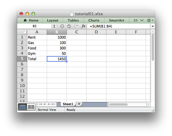
출력결과를 보면 간단히 저장되어 출력되어 지는걸 확인할 수 있습니다.
2. 엑셀파일 차트 삽입 예제
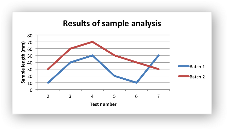
소스코드를 보시면서 분석해 보시기 바랍니다.
구글링을 해보니... XlsxWriter를 사용하는 것이 좋다는 의견들이 있어서...
XlsxWriter를 설치해서 사용해 보기로 했습니다. ^^
1. XlsxWriter 모듈 설치
c:\pip install xlsxwriter
pip 명령을 이용하여 간단하게 설치가 가능합니다.2. 예제 출력 예제
import xlsxwriter

# Create a workbook and add a worksheet.
workbook = xlsxwriter.Workbook('Expenses01.xlsx')
worksheet = workbook.add_worksheet()

# Some data we want to write to the worksheet.
expenses = (
    ['Rent', 1000],
    ['Gas',   100],
    ['Food',  300],
    ['Gym',    50],
)

# Start from the first cell. Rows and columns are zero indexed.
row = 0
col = 0

# Iterate over the data and write it out row by row.
for item, cost in (expenses):
    worksheet.write(row, col,     item)
    worksheet.write(row, col + 1, cost)
    row += 1

# Write a total using a formula.
worksheet.write(row, 0, 'Total')
worksheet.write(row, 1, '=SUM(B1:B4)')

workbook.close()
출력결과를 보면 간단히 저장되어 출력되어 지는걸 확인할 수 있습니다.
2. 엑셀파일 차트 삽입 예제
#######################################################################
#
# An example of creating Excel Line charts with Python and XlsxWriter.
#
# Copyright 2013-2016, John McNamara, jmcnamara@cpan.org
#
import xlsxwriter

workbook = xlsxwriter.Workbook('chart_line.xlsx')
worksheet = workbook.add_worksheet()
bold = workbook.add_format({'bold': 1})

# Add the worksheet data that the charts will refer to.
headings = ['Number', 'Batch 1', 'Batch 2']
data = [
    [2, 3, 4, 5, 6, 7],
    [10, 40, 50, 20, 10, 50],
    [30, 60, 70, 50, 40, 30],
]

worksheet.write_row('A1', headings, bold)
worksheet.write_column('A2', data[0])
worksheet.write_column('B2', data[1])
worksheet.write_column('C2', data[2])

# Create a new chart object. In this case an embedded chart.
chart1 = workbook.add_chart({'type': 'line'})

# Configure the first series.
chart1.add_series({
    'name':       '=Sheet1!$B$1',
    'categories': '=Sheet1!$A$2:$A$7',
    'values':     '=Sheet1!$B$2:$B$7',
})

# Configure second series. Note use of alternative syntax to define ranges.
chart1.add_series({
    'name':       ['Sheet1', 0, 2],
    'categories': ['Sheet1', 1, 0, 6, 0],
    'values':     ['Sheet1', 1, 2, 6, 2],
})

# Add a chart title and some axis labels.
chart1.set_title ({'name': 'Results of sample analysis'})
chart1.set_x_axis({'name': 'Test number'})
chart1.set_y_axis({'name': 'Sample length (mm)'})

# Set an Excel chart style. Colors with white outline and shadow.
chart1.set_style(10)

# Insert the chart into the worksheet (with an offset).
worksheet.insert_chart('D2', chart1, {'x_offset': 25, 'y_offset': 10})
workbook.close()
소스코드를 보시면서 분석해 보시기 바랍니다.
|
|
||||
|
이메일 문의 : cak0280@nate.com Copyright 2000 By ENTERSOFT.KR All Rights Reserved. |